In What Ways Does Your Media Product Use, Develop Or Challenge Forms And Conventions Of Real Media Products?
Using conventions
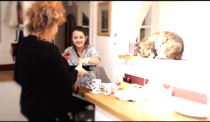
We used conventions throughout our trailer. The first one we used in the kitchen showing that everything is normal and that the mother is unaware of anything bad happening around her, that is why later on it gets worse because it was invisible for her to prevent it.
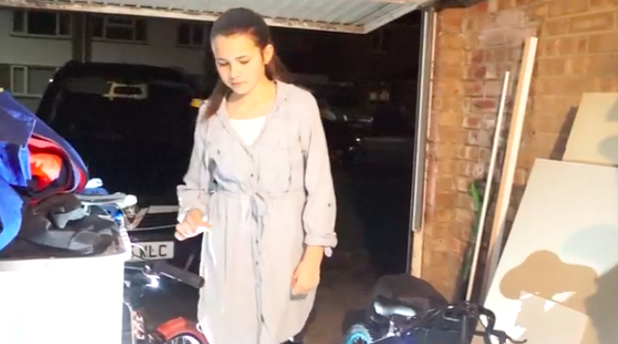
The second convention we used was in the garage when she was looking for the evil spirit. This is when we started to build suspense because the audience are unaware of what bad things may happen if she finds MAYA.
The third convention we used was speeding up pace during the last quarter of the trailer. The short clips show all the bad things that are going to happen caused by the young girl. A very fast pace is a good tension build up after its already beens started slowly.
|
|
|
developing conventions
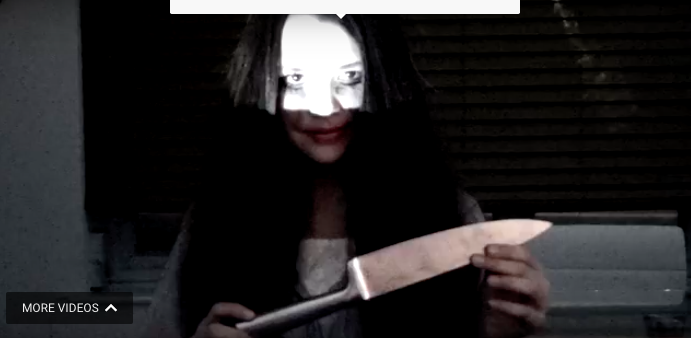
Our two main props were a knife and a doll. We used a knife as a weapon to kill the mum as we needed to show the mum obviously getting killed. However, we developed conventions by using the doll. We made the audience aware that the young girl had an attachment to her dolly but have challenged the conventions of the doll being an ordinary doll. The audience are unaware of the doll being possessed causing the girls imaginary friend to possess her as the doll has made her.
Another way we developed convention was through high key lighting. This is developing convention as in most horrors low key lighting is used because it makes it builds more tension and suspense. We used a lot of high key lighting at the beginning of our trailer to show that nothing was wrong and everything was normal.
Another way we developed convention was through high key lighting. This is developing convention as in most horrors low key lighting is used because it makes it builds more tension and suspense. We used a lot of high key lighting at the beginning of our trailer to show that nothing was wrong and everything was normal.
|
|

|
Challenging conventions
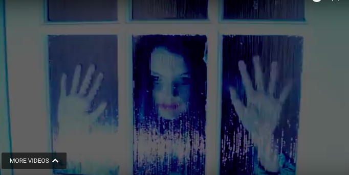
We challenged conventions by only using females throughout the trailer. In most horrors they have males who are either the killers or heroes who save characters at the end. We decided to challenge this because we wanted to show that females can be powerful and cause a lot of harm too. We have also changed the way victims are shown. Normally in a horror stereo typically a young blonde girl will get possessed or hurt. However we decided to have a girl with brown hair and that is really young to show that age doesn't matter when a spirit is trying to get into someones body and posses them. Instead of showing them as just victims of possession we decided we wanted to make the characters look evil, which is also challenging conventions.
poster
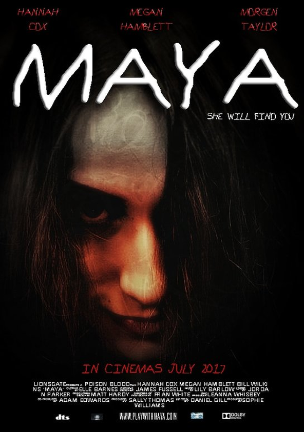
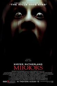
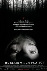
When creating our poster we chose to use a dark background contrasting with white writing, also adding red on three quarters of her face. We chose to make the main focus her face because it looks evil, and obvious that its a horror related film. In horror red is stereotypically seen as blood and bad, which relates to the young girl hence we used the colour. While researching many other horror posters with a paranormal genre have done similar things. We found that the posters from 'Mirrors' and 'The Blair Witch Project' are similar to the poster we created because of the dark colour schemes. It creates a concealed, isolated, gloomy feel adding tension and hesitation to what the film may be about if the audience has only seen the poster. The dark colour scheme suggests that the young girl may be possessed due to the photo not looking like a stereotypical young girl.
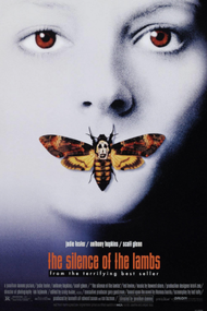
The poster for the film 'The Silence Of The Lambs' is the complete opposite to ours. Although the photo is a close up of a face like ours, the main colour of it is white. They have portrayed the same idea as us using the colour red to symbolise evil and bad. Having the main colour as white opens up the photo making it more innocent however can sometimes give a ghostly effect. We didn't use this photo for inspiration because it would contrast the idea of the young girl being possessed.
The poster for the film 'The Silence Of The Lambs' is the complete opposite to ours. Although the photo is a close up of a face like ours, the main colour of it is white. They have portrayed the same idea as us using the colour red to symbolise evil and bad. Having the main colour as white opens up the photo making it more innocent however can sometimes give a ghostly effect. We didn't use this photo for inspiration because it would contrast the idea of the young girl being possessed.
|
|
|
Movie posters use the convention of putting the actors names at the top of the poster and who was involved of the making at the bottom. Due to wanting ours to look professional, we chose to follow the same process. This is so the audience are aware of who is featuring in the film; we included our top/main 3 characters real names. To also follow the structure of making our poster professional we added credits of who was involved at the bottom of the page.
We decided to put the title of our film 'MAYA' at the top of our page big enough to touch each sides, central on the page so that it was easy and clear for the audience to read. We used the font 'Kindergarten' which looks handwritten by a young child or by someone who is struggling to portray that its either the girl who has written it or MAYA, who is the possessed imaginary friend. We chose the tagline 'she will find you' because it creates suspense and tension towards the audience because its addressed to them. We chose the font colour white for the both of them to contrast against the dark background otherwise the audience may not be able to read it clearly. It also suggests a sense of normality which the girl does have at the beginning of the film before she finds Maya. We chose not to use a colour like blue, green or yellow as they would be completely irrelevant and stand out making it look colour and giving the wrong impression that it may be aimed for someone younger than the age rating. We also decided not to chose the colour red for the font which can be linked to horror by blood and evil because it didn't flow and stuck out like a sore thumb. Reasoning to why we placed our tag line off centre to the right of the page underneath the title is that its not a main feature or focus of the poster, but however can still leave a lot of impact. Most horror posters only have a few words for their tag lines which is why we have only chosen 4. Short, snappy and straight to the point is quick and easy for the audience to read and understand because they don't have to sit for ages reading it.
We included dolby digital and DTS at the bottom of the page due to them being an advanced sound audio technology software that allows Dolby audio experience in home theatres, smartphones, operating systems and browser. We included these as all posters has them and we wanted to follow the path of making it look professional.
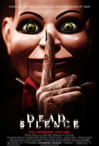
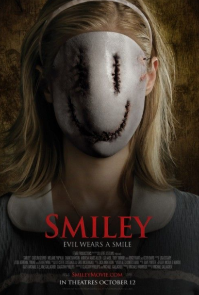
While planning our poster we decided that we wanted to take a new photo and not use a still off our trailer because there were not any that are effective or show an iconic image of what the trailer is about. Our image links to the horror convention of using a female to show weakness and something bad is happening. However we contrasted with the stereotypical view of a blonde girl getting hurt because in our trailer the young girl gets possessed and hurts everyone else. By using an image of a girl we are trying to advertise to both female and male target audiences by using something that they may both be interested in watching. Examples of these are dead Silence which has 'You scream. You die.' Also Smiley which has 'Evil wears a smile'.
|
|
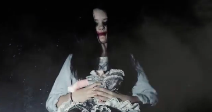
The image on our poster is of our main character throughout the trailer. We chose to use a picture of her for our poster cover because it contrasts against the horror conventions of a male being a killer. We chose to take the picture how we did because it it could suggest that she is was once the victim and somethings turned her evil. The red on her face gives the audience a clue that she's unpleasant and malicious because in horror red is seen related to blood and evil. We wanted to come away from this convention and show that our main character looks suspicious and something unusual will happen. Another movie that has used their main character as their picture for their poster is insidious. This is similar to ours as they started off innocent then something has come in the way causing them to become possessed.
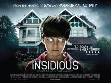
The fonts we have used are for our title 'MAYA' was Kindergarten. We chose this font because it looks like a child's hand-witting as we are trying to make it look like the young girl wrote it herself. We chose to have it in white so that it contrasted against the dark background, making it clearly visible and readable. The font and colour choice we used was the exact same for the tag line however we made it a smaller size so that it was clear it was a tagline and not apart of the name. We took inspiration from Insidious's text as it is contrasting against a dark background in white,, making it clear to read.
MAGAZINE COVER
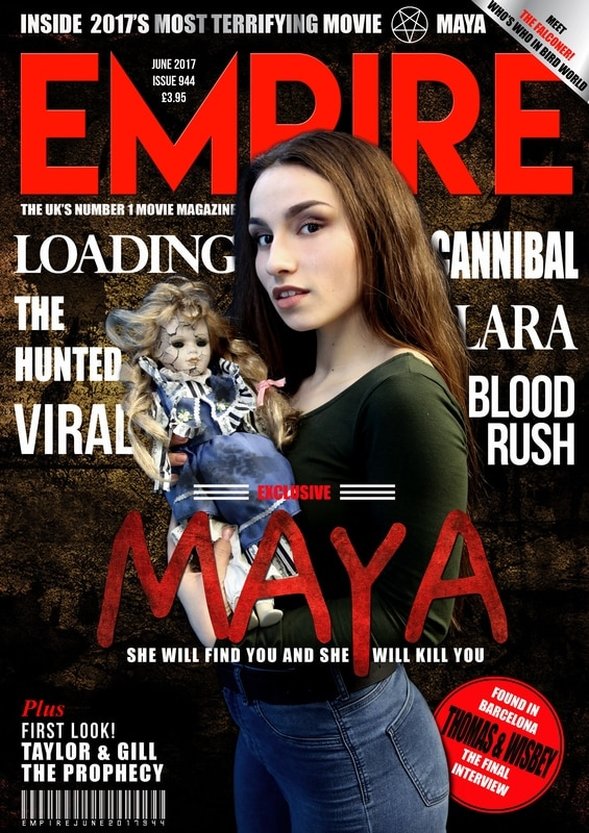
We chose to use a brunette girl on the front of our magazine to go against the conventions of horror by the victim stereotypically being blonde; as we wanted it to be different. We didn't use a male for the picture because in the trailer there are no male characters, and if there was we wouldn't want to follow the stereotypes of the male being a strong character. While researching, a lot of magazine covers have the male and female on the front, with the male being in power. We didnt do this due to the fact we didnt want to follow Clovers theory of the girl being weak as it wouldn't fit with our storyline. We positioned her facing the camera, looking at the target audience and making eye contact with them.
Using a girl on the front holding a dolly suggests to the audience that shes innocent. This matches the stereotypes of young girls, however little do the audience know from the poster that the girl isn't the victim. We didn't use a still image from any part of our trailer because we wanted to show what she is like before all the possession happened to her and that she was a sweet innocent young girl. If we used a still image from the trailer it would suggests to the audience that shes not the victim. Challenging conventions, we chose to use a dark hair girl so it wasn't a stereotypical.
We chose to use the dolly because we wanted the girl to look as if she wasn't just a victim like most girls in horror. Although she is a victim in possession at one point, she is still a villain as she possess others and can make people hurt other people. This is challenging convention because we have gone away from the idea of the girl just being the victim.
We used a dark red color with smudges of black for our font because it will instantly make the audience think of evil and blood if its a horror film. We used the colour red for the important parts of the poster so they stand out and contrast against the background. We put the name of the movie in red and big font as it's the most important part of the magazine. Even though red stands out well against the background we used a white font for the remaining texts because its clear to read against a dark background. We used a convention because this is commonly used in magazines. For the background of our poster we used a picture of a ground outside with a bit of light reflection. This is challenging conventions because most magazine covers use a plain white or black background. This makes our magazine different to conventional horror ones.
We put the title brand of the magazine in the at the top of the page as this follows conventional magazine covers as its big and clear to read. This way customers are able to see what brand it is and find it easily on shelves. We decided to put the title 'MAYA' in the middle of the page in front of the girls body because it looked clear to read and and contrasted against the colour of her top. We put the titles of other films around the girl as we didnt want them to obstruct the view of her or draw any attention away from her. This is a conventional movie magazine as all magazines put names of other films on them. This can also be a developing convention as a lot of magazines have their text overlapping the image on the front. We thought that putting these names in white went nicely on the background and it is using conventions as a lot of magazines use this colour. We added extra features 'Found in Barcelona, Thomas and Wisbey the final interview' and 'plus, first look! Taylor & Gill The Prophecy'. We put these titles in shapes and different sizes because it looks more interesting and fun for the audience to look at, and making it look professional. Although magazines use this convention, we are developing conventions because we had to adapt the different text so that it fit with ours.
To create a conventional magazine cover we stuck with similar templates, colours and fonts as others so that it was visually simple to look at; doing this also makes it look professional. For the title of the magazine we found a very similar font to what the actual brand uses. We chose to do this because we wanted it to look professional. By doing this, we followed conventions as the text was the same font, colour and size. We used the same fonts on our magazine cover as we used on our poster and trailer, which was 'Kindergarten'. Underneath our title is our tagline but the long version, not the short which we included on our poster cover. We decided to use our long tagline because it goes into more detail about what the girl will do to you, and as it is a magazine containing loads of detail and information it made sense. This also followed horror conventions as its the way it looks best.
|
|
|
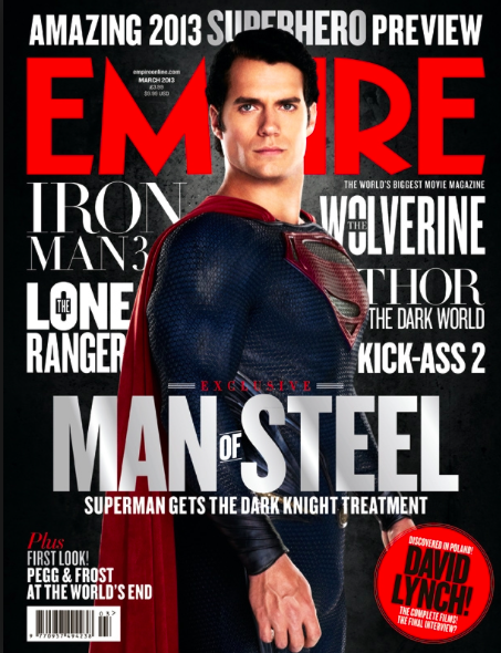
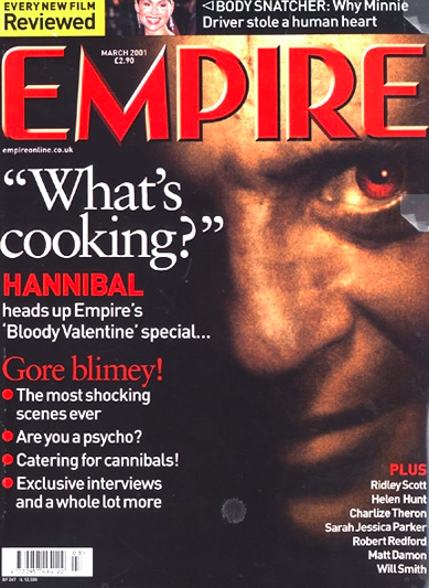
These are some magazine covers that we researched into and took inspiration from. We chose 'EMPIRE' because we found that they had the best layout and templates for horror films. We focused on trying to make ours look similar too the 'Man of Steel' magazine because it has a dark background with texts that contrast clearly. Our title 'Empire' is a lot like this so we could follow conventions. All of these magazines inspired us to only have one person on the front as it puts the focus on only them.
