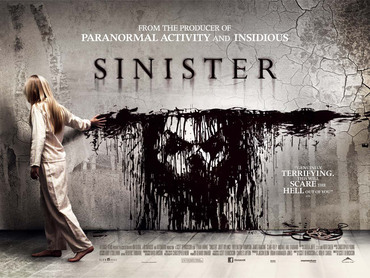
SinisterThe poster created for Sinister uses neutral colours to construct an eary effect. They use a bold title which makes it eye catching towards the target audience. The positioning of the girl draws the eyes of the audience straight to the face created on the wall. The cracks on the wall could represent the cracks in her life which she is trying to re-patch up by killing people. The poster contains many parts E.g. the girl, the face and the cracks which makes the audience always have something to focus on.
|
|
|
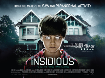
insidiousThis poster displays a young boy in front of his house with his eyes scratched out. This suggests that he is possessed and could maybe be looking for his next victim. The way in which this boy is positioned is good and the creates have done it well, this will be effective towards the audience because they will want to find out what happens next. These film makers have used different lighting techniques which is showing the audience that the sky looks worse than it actually is.
|
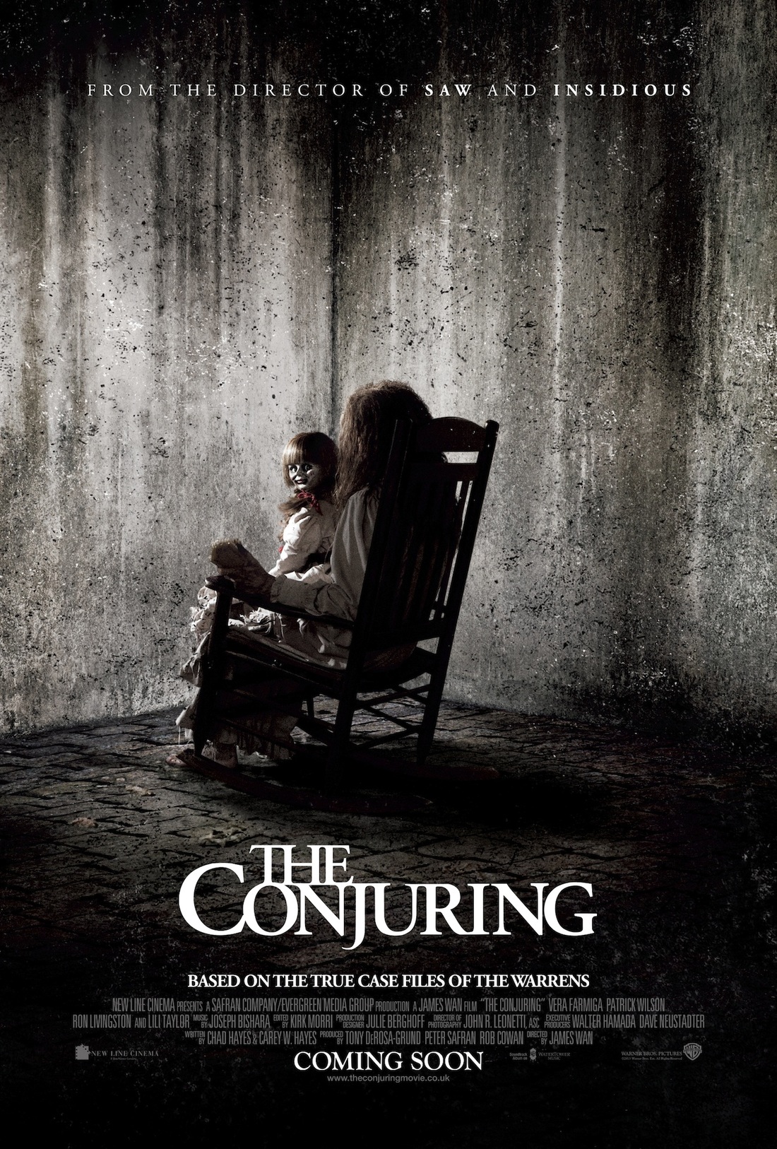
The conjuringThis poster is showing that the colours are also quite ordinary. The colours they have used to show the audience is black and white, you can also see that within the title they have used it is also using the same colour choice. There is blood on the doll and this makes the target audience more aware of the way in which she is positioned. Also with the way the doll is positioned it shows the audience that she is looking straight towards the camera therefore make us as the audience more scared. They have used this in an effect way and so it will make the audience wanting the wonder what is going to happen next with the trailer. They are going to want to see the link between both of the characters.
|
|
|
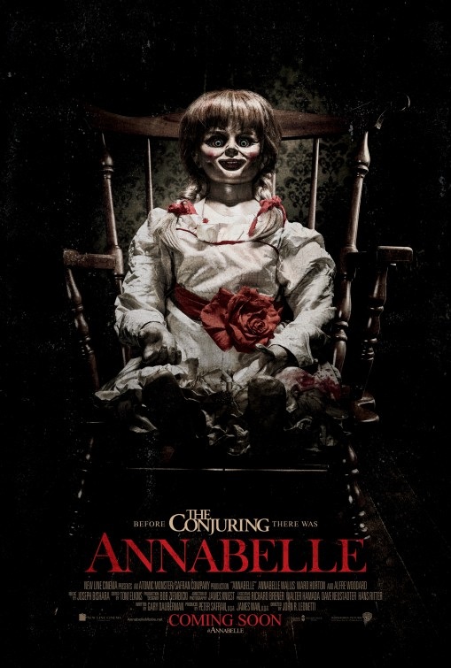
AnnabelleFrom this poster we can see that the main part of the poster is focussed on the doll sat on the chair. The white dress that the doll is wearing could represent innocence to contrast the reality of the doll actually being malicious and harmful. The colour red used is quite distinctive due to it being against a black background and a white dress. This could represent that she is dangerous and deadly. The doll is positioned in the centre of the poster leading the eyes of the audience straight at her. This is a good technique because they will instantly know what the film is about, and the bad intentions that they doll has created just by her appearance. The titles at the bottom of the poster is clear and bold for the audience to read. The not colour chosen makes it stand out against the dark background and makes the audience feel hesitant to watch because the colour can be represented as quite alarming .
|
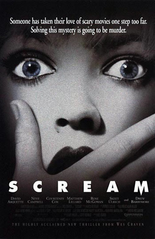
SCREAMAs the poster has used monochrome colours, it ensures that there are no bright colours to distract the audience. The close up image of the scared girl reflects to the audience how scary the film actually is. The picture and colour choice keeps the story quite mysterious due to the use of simple colours. If any of the audience have not watched the film before, the quote/saying at the top can lead them on due to it being integrating. The title at the bottom of the page is clear, bold and spaced out a lot. Because of this
|
|
HC MH
